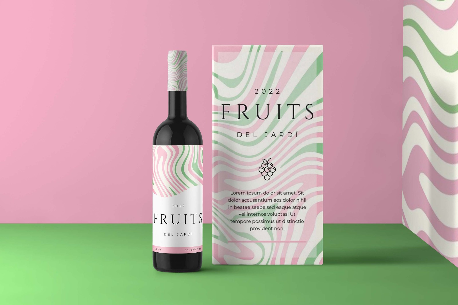
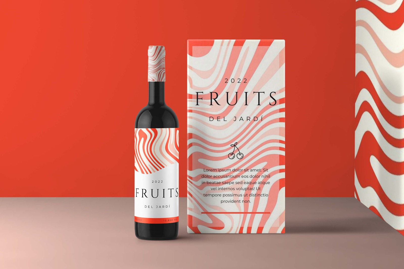
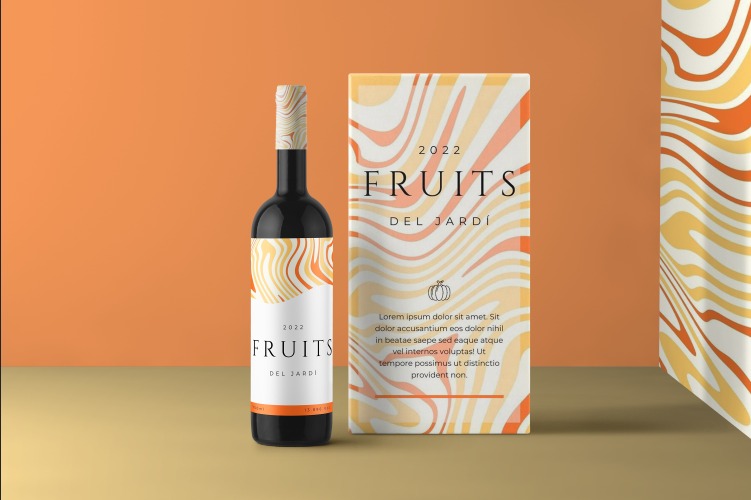
Creation of an elegant wine packaging collection where each variety is distinguished by fruit-inspired colors and refined typography, combining sophistication, color, and motion in a clean, balanced design.
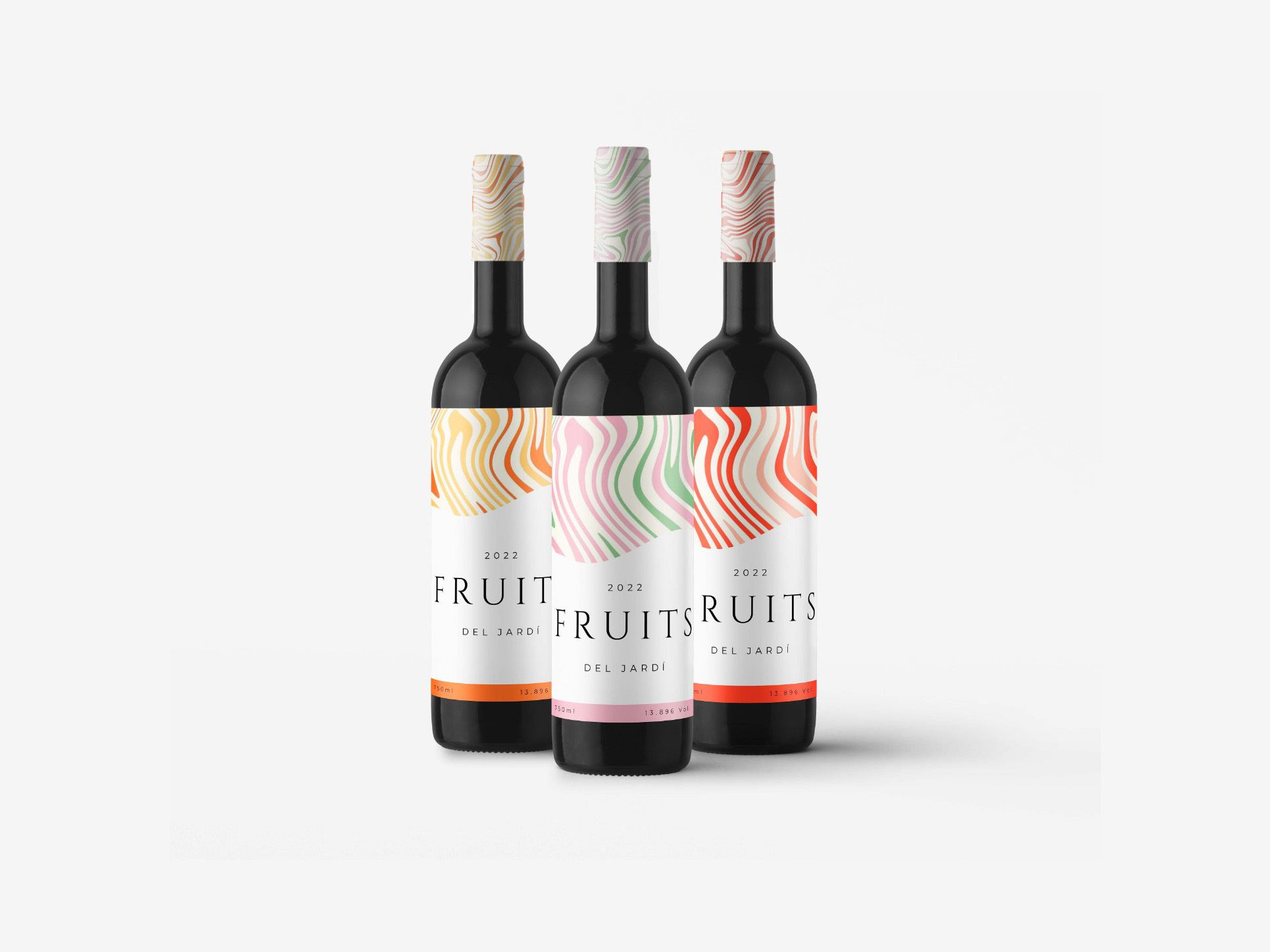
This project involved designing the packaging for Fruits, a conceptual wine collection that
communicates product qualities through its visual identity. The aim was to create an elegant
yet expressive label system where each wine flavor could be distinguished by color, while
maintaining a refined and cohesive brand image.
For each wine variety, the color palette was based on the fruit that defines its flavor
profile, allowing users to intuitively associate color with taste. The typography and label
layout convey sophistication through fine lines and minimalistic elements, while the
background graphics add a sense of motion and personality. The result is a clean yet vibrant
design that balances elegance with visual richness.
I developed the visual identity and packaging design for the entire product range. Also, I defined the color system for each wine flavor, designed the label compositions, and selected typographic elements that express refinement and modernity. The final collection successfully combines elegance, color, and symbolism, ensuring that each bottle communicates both its flavor and the brand’s personality.

Adobe Illustrator

Adobe Photoshop