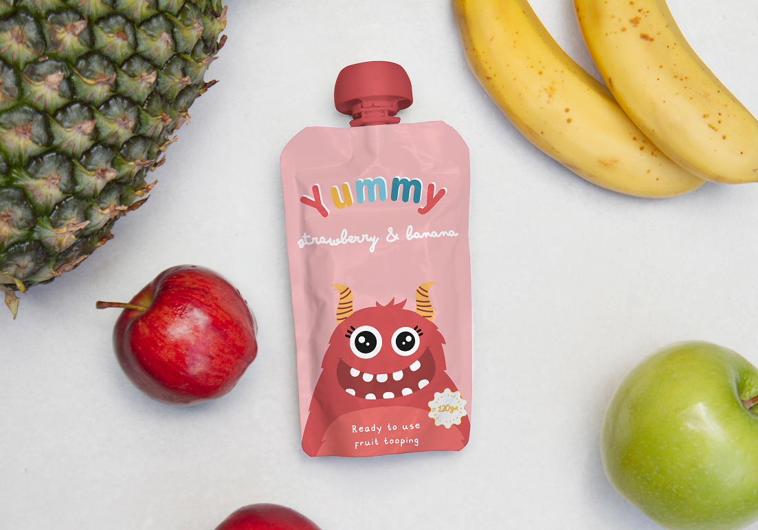
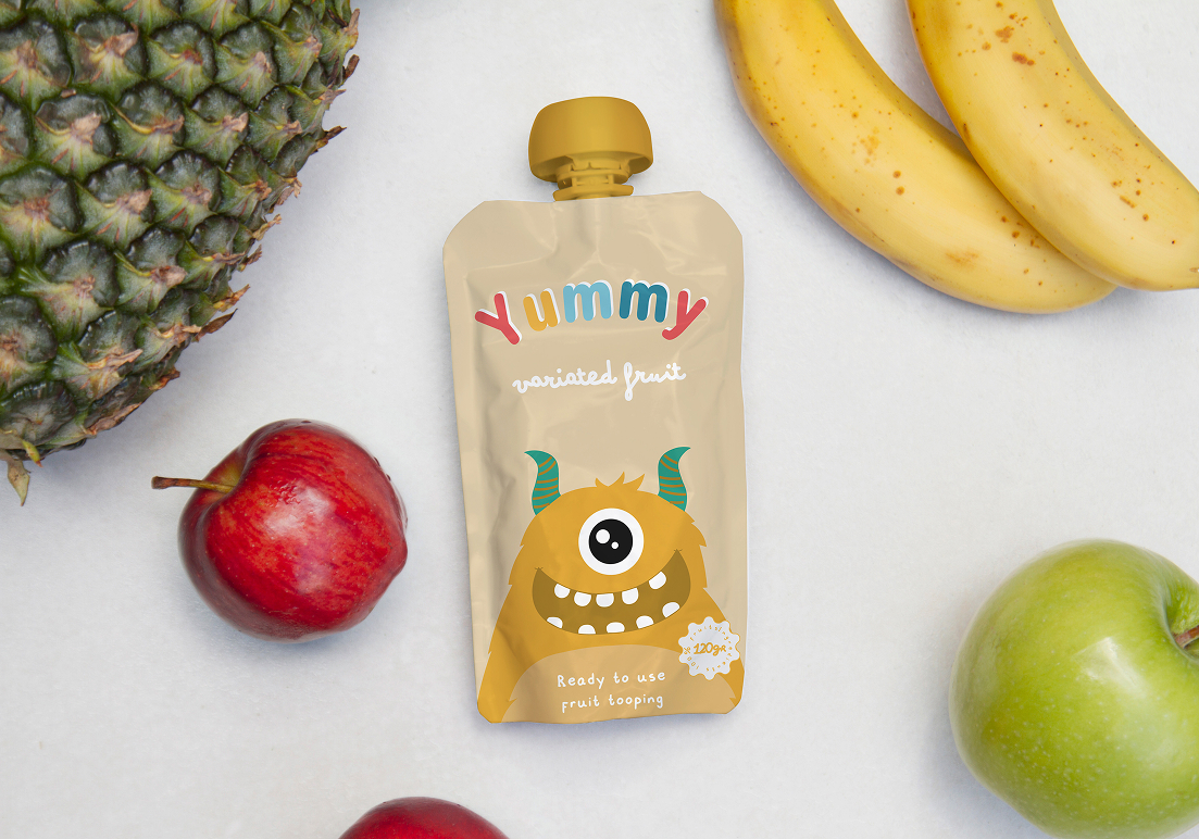
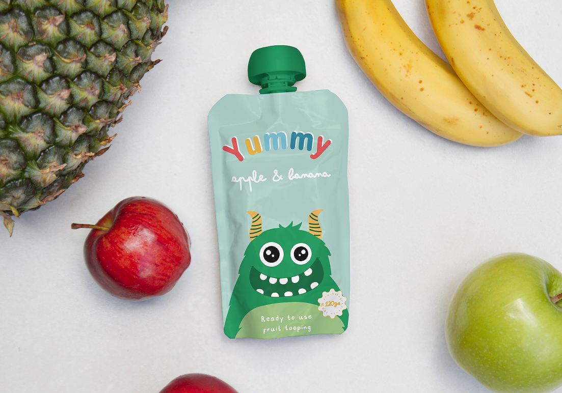
Design of a drinkable yogurt line for children, featuring playful colors, typography, and visual elements inspired by kids’ preferences and perception, creating an attractive and fun packaging experience.
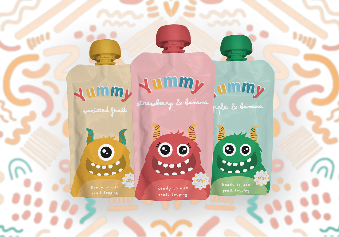
This project focused on designing the packaging for Yummy, a line of drinkable yogurts for
children. The goal was to create an appealing and playful visual identity that would attract
young consumers while remaining clear and practical for parents.
To achieve this, a research phase was conducted to understand children’s color preferences,
visual stimuli, and perception of fun and flavor. The design incorporated bright colors,
rounded shapes, friendly typography, and dynamic graphic elements that evoke movement and
energy. The packaging sought to reflect a sense of joy and freshness while maintaining
legibility and balance in the overall composition.
I researched children’s visual preferences and adapted the design to their perspective. I developed the complete visual identity of the product including logo, color palette, illustrations, and label composition, ensuring a cohesive and eye-catching result. The final design captures the playful spirit of the brand while communicating flavor and fun at a glance.

Adobe Illustrator

Adobe Photoshop